Developing a focus style for a themable design system
Focus styles are visual indicators used to style elements, usually links and form elements, that have been focused by the user, either by “tabbing” using the keyboard or by clicking.

Focus styles help people with low vision conditions, cognitive concerns, or motor impairments identify interactive elements.
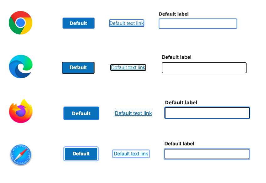
Browser default focus styles
Default browser focus styles aren’t always reliable in the context of your brand theming and color palette. For example, if your brand color palette uses blue and the default browser focus style is also blue then little contrast exists when something is being focused and you run the risk of the focus style blending in with the brand colors.
The default focus styles provided by browsers are typically blue but can differ between each browser, so they’re highly visible in some scenarios, like on a white background, and very hard to notice in other scenarios, like on a blue button.

Improving design system focus styles
On a recent project, we had a set of focus styles built into a design system that were inconsistent and ineffective, leading to a not-so-great end user experience. We decided to revisit them to make for a better focus experience throughout the design system.
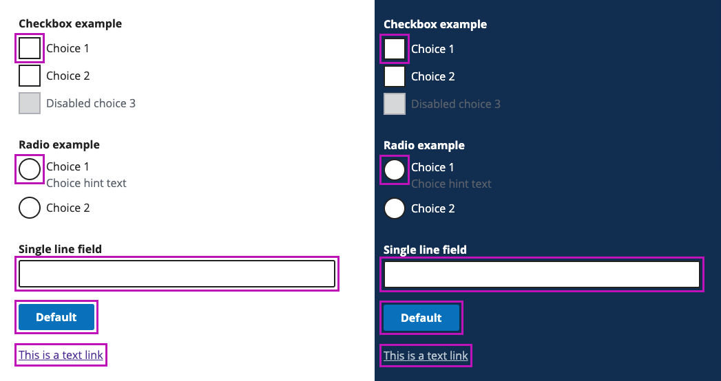
The inconsistency arose because some elements used the browser default focus styles, like links and buttons, while other elements like text boxes and dropdowns relied on custom focus styles. In some instances, the focus styles were ineffective because the color contrast of the focused style compared to the focused element wasn’t enough to ensure visibility by as many users as possible. In addition, sometimes the focus style lacked a high enough contrast to the page background.
Example of focus styles that were using the browser default and custom focus styles mixed:

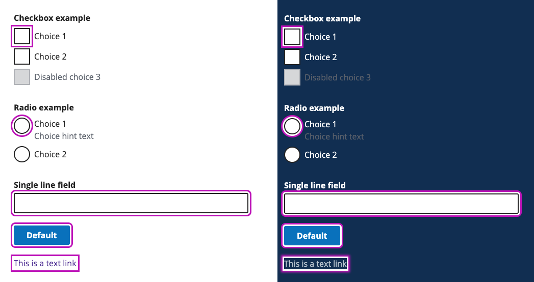
We also support sub-brands with the design system, and those also had similarly inconsistent and ineffective focus styles. The design system did not provide custom focus styles for all elements so the team created its own additional focus styles resulting in two custom focus styles. This resulted in an inconsistent focus experience and one of the focus styles did not meet color contrast.
Example of sub brand focus styles that were using two different styles for focus styles:

As we thought about how to create a new focus style for the design system that applied consistently and would be themable for our sub brands, we outlined our guideposts for the work.
Goals for the improved focus styles
We wanted to create a focus style that would improve the usability and accessibility compliance across the design system and could be easily adopted and customized by design system sub brands.
Specifically that meant:
- We wanted to improve the feature’s usability and accessibility compliance by helping users with attention, short term memory, or executive process limitations discover where the focus is located.
- We wanted to highlight the focus universally for all users while complementing the existing user interface (UI) color palette.
- We wanted to create an intentional focus experience instead of relying on browser defaults.
- We wanted to ensure the design system complies with WCAG 2.1 and be future friendly to WCAG 2.2.
Starting with focus techniques
Before we got into thinking about color choices, we explored various techniques for applying a focus style. This allowed us to then determine which technique had the most flexibility as well as evaluate advantages and disadvantages for each technique. We also wanted to start with techniques so we could align with our stakeholders before moving on to something like colors and design.
We looked at the following:
Outline
Outline has square edges and does not offer much customization.

Customizations:
- Color: sets the color of an element’s outline
- Style: sets the style of an element’s outline (solid, dashed, dotted, etc…)
- Width: sets the thickness of an element’s outline
Box-shadow
Box-shadow can have the appearance of an outline or border and offers more flexibility than outline or border for customizing.

Customizations:
- Color: sets the color of an element’s box-shadow
- Position (X/Y): sets the horizontal and vertical distance of the box-shadow
- Blur radius: sets the amount of blur to be applied to the box-shadow
- Spread radius: sets the amount the box-shadow will spread
- You can apply multiple box shadows to an element
Text-decoration underline
Text-decoration underline only works for buttons and links and does not work for form elements such as text inputs or radio buttons.

Customizations:
- Color: sets the color of decorations
- Line: sets the kind of decoration that is used
- Style: sets the style of the lines specified (solid, dashed, dotted, etc…)
- Thickness: sets the stroke thickness of the decoration line
Border
Borders can have the appearance of an outline that hugs the element it’s applied to or can appear as an underline if only applying the border to the bottom.

Customizations:
- Color: sets the color of an element’s outline
- Style: sets the style of an element’s outline (solid, dashed, dotted, etc…)
- Width: sets the thickness of an element’s outline
- Border-radius: sets the amount of rounding applied to the corners of an element’s outer border edge
Background color
Background color offers the least amount of customization and only offers color as a way to modify it.

Customizations:
- Background color: sets the background color of an element
Focus techniques compared
We compared these different techniques against some common scenarios for the design system.
| Scenario | Outline | Box-shadow | Border | Text-decoration underline | Background color |
|---|---|---|---|---|---|
| Doesn’t take up the height or width on the page | Good | Good | Poor | Good | Good |
| Can control spacing from focused element | Good | Poor | Poor | Good | Good |
| Works well with Windows High Contrast mode | Good | Supported | Supported | Good | Supported |
| Consistently applied to all elements | Good | Good | Good | Poor | Good |
| Honors the border-radius property | Poor | Good | Good | Poor | Good |
| Works with letters that have descenders | Good | Good | Poor | Good | Good |
| More styling options | Poor | Good | Poor | Poor | Poor |
| Can use more than one color | Poor | Good | Poor | Poor | Poor |
It is common to use border, background color, and box-shadow when creating custom focus styles. However, Windows High Contrast Mode ignores these properties making your focus style invisible in WCHM. This can be fixed by using the default outline property and making it transparent: outline 3px solid transparent. WHCM will override the transparent outline color, making it visible only when high contrast mode is turned on.
Based on these ratings, box-shadow and outline were our top two techniques, but we ultimately selected box-shadow over outline because there were more options for design flexibility like the layering of multiple box-shadows and honoring of the border-radius property.
Exploring single and double color techniques
Once we selected the box-shadow technique, we then explored the options of using a single color or two colors for the focus styles.
Using a single color
When you use a single color, it either meets contrast on a light background or meets contrast on a dark background but won’t work well for both. Focus styles that only use one color are not as flexible and resilient because they’re only effective in certain situations, which narrows the range where they would successfully meet contrast ratios.
In this example, the purple focus style meets 4:5.1 contrast on the light background but does not on the dark background:

Using two colors
When you use two colors, the focus will have sufficient contrast against most background colors. This technique ensures sufficient contrast of the focus indicator when viewed against different backgrounds because both a light and dark color are used in the focus style. We took inspiration from Chromium and the Slack application which use a two color approach to focus styles as well.
In this example, the purple in the focus style meets 4:5.1 contrast on the light background and the white focus style color meets 4:5.1 contrast on the dark background:

We selected the two-color approach due to the flexibility of the focus style working in more situations.
Focus style color exploration
Now that we had our technique and number of colors that we were going to use for the focus styles, we began to look into what color options would work well for the design system and explored options that would fit into both sub brand themes.
We explored color options that were already in use in the brand palettes as well as new color choices that would compliment the brand. This helped us get a sense of what types of colors would compliment the design system palette and also meet color contrast ratios for focus styles.
We wanted to make sure the color selected met at least 3.1 color contrast on a white background and set a stretch goal for the color to meet 4:5.1 color contrast on white. We evaluated multiple colors against these requirements and goals and came up with the following concepts.
Existing colors from sub brands
| Color name | Color swatch | Meets 4:5.1 on white | Meets 3.1 on white |
|---|---|---|---|
| Focus coral #CD635B | No | Yes | |
| Focus orange #DF6D52 | No | Yes | |
| Focus gold #F6AE2D | No | No | |
| Focus tangerine #EEA243 | No | No | |
| Focus sand #AF6118 | Yes | Yes | |
| Focus blue #3F84E5 | No | Yes | |
| Focus green #1B998B | No | Yes | |
| Focus elm green #1B7869 | Yes | Yes | |
| Focus deep sea green #008853 | Yes | Yes | |
| Focus eggplant #BD13B8 | Yes | Yes | |
| Focus orchid #94679A | Yes | Yes | |
| Focus rose #883955 | Yes | Yes | |
| Focus magenta #AF3B6E | Yes | Yes |
Possible new colors
| Color name | Color swatch | Meets 4:5.1 on white | Meets 3.1 on white |
|---|---|---|---|
| Focus coral #CD635B | No | Yes | |
| Focus orange #DF6D52 | No | Yes | |
| Focus gold #F6AE2D | No | No | |
| Focus tangerine #EEA243 | No | No | |
| Focus sand #AF6118 | Yes | Yes | |
| Focus blue #3F84E5 | No | Yes | |
| Focus green #1B998B | No | Yes | |
| Focus elm green #1B7869 | Yes | Yes | |
| Focus deep sea green #008853 | Yes | Yes | |
| Focus eggplant #BD13B8 | Yes | Yes | |
| Focus orchid #94679A | Yes | Yes | |
| Focus rose #883955 | Yes | Yes | |
| Focus magenta #AF3B6E | Yes | Yes |
For the design system and on of the the sub brand themes, we selected a focus eggplant color of #BD13B8, which meets both 3.1 and 4:5.1 color contrast on white backgrounds. In addition, the focus eggplant color compliments the current design system color palette and stands out while not being too distracting.
For our other sub brand, we selected a focus orange color of #DD3603, which also meets both 3.1 and 4:5.1 color contrast on white backgrounds, compliments the sub brand color palette, and can be seen as an accent color in illustrations throughout the site and applications.
If you’d like to do a similar comparison for your design system, there are a lot of great WCAG compliant-color tools out there. Here are a few that we used:
- Accessible color palette builder
- Colors that look and work great for everyone
- Tanaguru contrast-finder
- Color contrast checker, analyser and color suggestions
- WebAIM contrast checker
- EightShapes contrast grid
We were nearing the finish line and during our explorations, testing, and finalizing of the focus style for the design system and its sub brands we found an issue that we needed to address before officially releasing the update. This issue was that multi-line links with the new box-shadow focus style did not perform well from a design or readability standpoint. Box shadow offers more options when it comes to styling but is not as functional as using the outline property. Here is what we were seeing when using the double box-shadow on multi-line links, yuck!

We tried a few different options and decided to use the outline property for links in addition to a background color so that we can still have one focus style that works for both light and dark backgrounds.

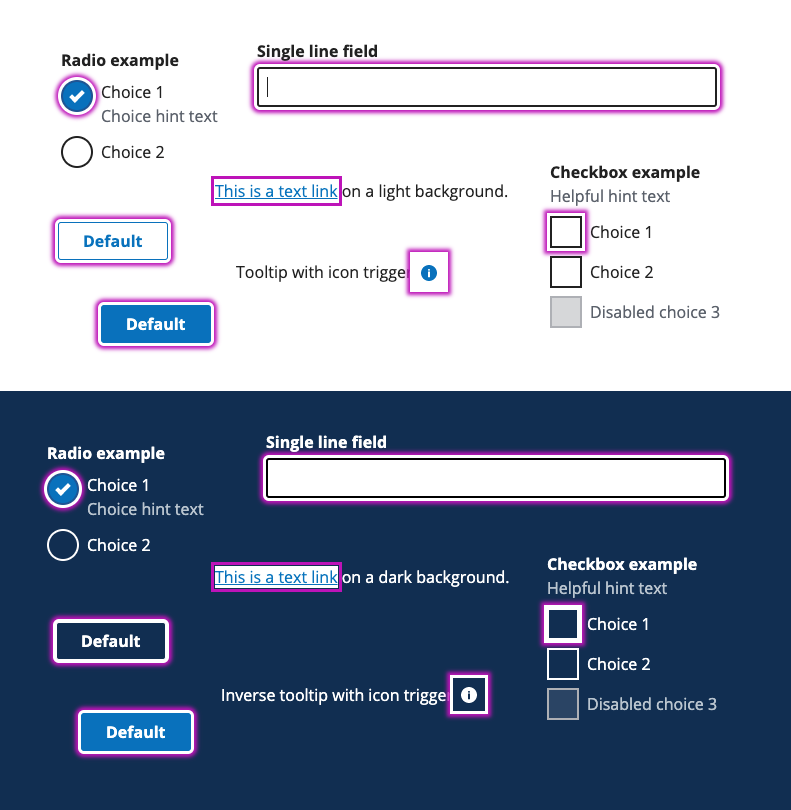
Our new focus styles
After exploring 18 different techniques and 19 different color options, we felt we had reached our goal of creating a focus style that will improve the usability and accessibility compliance across the design system and could be easily adopted and customized by the design system’s sub brands.

The box-shadow technique provided us enough flexibility by using multiple colors, did not take up any height or width on the page, was consistently applied to all elements, honors the border-radius property, and works well with descending letters.
Our final focus color was Focus eggplant - #BD13B8. We expect the majority of focus styles will be seen on light or white backgrounds. Therefore, we prioritized choosing colors that meet contrast on lighter backgrounds. This color also works for our sub brands if left unthemed. However, each sub brand can select its own color to better serve the people who interact with its components every day.
We stayed away from teals and blues for the focus color because they’re a dominant hue in the design system already.
Meeting WCAG guidelines
Our new focus style would meet both current and potential WCAG guidelines.
1.4.1 Use of Color (WCAG 2.0**)
**Using the outline around elements means we’re not relying on color alone to communicate the focus state.
1.4.11 Non-text Contrast (WCAG 2.1**)
**The use of multiple colors means that in most situations, the color contrast will be above 3:1 for the focused state.
2.4.7 Focus Visible (WCAG 2.0)**
**We meet this by supplying our own highly visible focus indicator.
2.4.11 Focus Appearance Minimum (WCAG 2.2)**
**While WCAG 2.2 isn’t finalized yet, we’re looking to the future.
- The outlines wrap around entire elements and are at least 2 pixels thick meaning the focus state meets “minimum area” requirements, which define how much space a focus indicator should take up to be noticeable.
- The use of eggplant and white means we meet a contrast ratio of at least 3:1 between the colors in the focused and unfocused states.
- The choice of colors and outline thickness means we meet a contrast ratio of at least 3:1 against adjacent colors in the focused component, plus the contrasting area has a thickness of at least 2 CSS pixels.
How we set up theming
Focus style variables
We created two focus style variables—one to be used for the inner box-shadow and one for the outer box-shadow. This allows sub-brands to easily customize their focus styles to fit with their brand.
$color-focus-light sets the inner box-shadow for the focus styles. $color-focus-dark sets the outer box-shadow for the focus styles. This color should pass a 3:1 contrast ratio on white or light backgrounds. Using focus styles on custom components We created a mixin for easily adding focus styles to custom components that are not in the design system and might need their own focus state styles.
The mixin @include focus-styles; can be used to apply the focus styles consistently without needing to write custom styles in an application or product.
Example:
.customButton:focus { @include focus-styles; }
The focus-styles mixin applies the following styles for the box-shadow. In addition, we’re adding outline and outline-offset to support Windows High Contrast Mode.
box-shadow: 0 0 0 3px $color-focus-light, 0 0 4px 6px $color-focus-dark; // Add support for Windows High Contrast Mode (WHCM) // The transparent color only shows when WHCM is triggered outline: 3px solid transparent; outline-offset: 3px;
We’re currently in the process of deploying our new focus styles and feel confident that this update will result in a more consistent, more WCAG-compliant, and more themable focus style for the design system and its sub-brands.
Related posts
- Accessibility compliance: Start with the right tools
- Developer-driven focus management for single-page applications
- Become a champion for Section 508 compliance by using annotations
- The right benchmarks
- The 21st Century IDEA Act Playbook Part 1: Accessibility compliance, appearance, and overlap
- The case for null in design systems
