Retooling Find Local Help using human-centered design
Agency
Centers for Medicare & Medicaid Services (CMS)

When people hit the moment in the HealthCare.gov sign-up process where they need in-person help, they're likely frustrated and at risk of abandoning the process altogether.
To help, Ad Hoc designers on the Centers for Medicare & Medicaid Services (CMS) Find Local Help team extensively researched user pain points and used human-centered design to create a tool that respects the stress users may experience and delivers the information they need as quickly and simply as possible.
The research
Find Local Help is a tool from CMS, which runs HealthCare.gov, that connects people to in-person, one-on-one help signing up for health insurance. Users can enter their location and get a list of local experts who can help them complete the process for free.
When we began work on the system, we discovered two primary constraints limiting users' experience:
- Slow search results restricting the tool's design
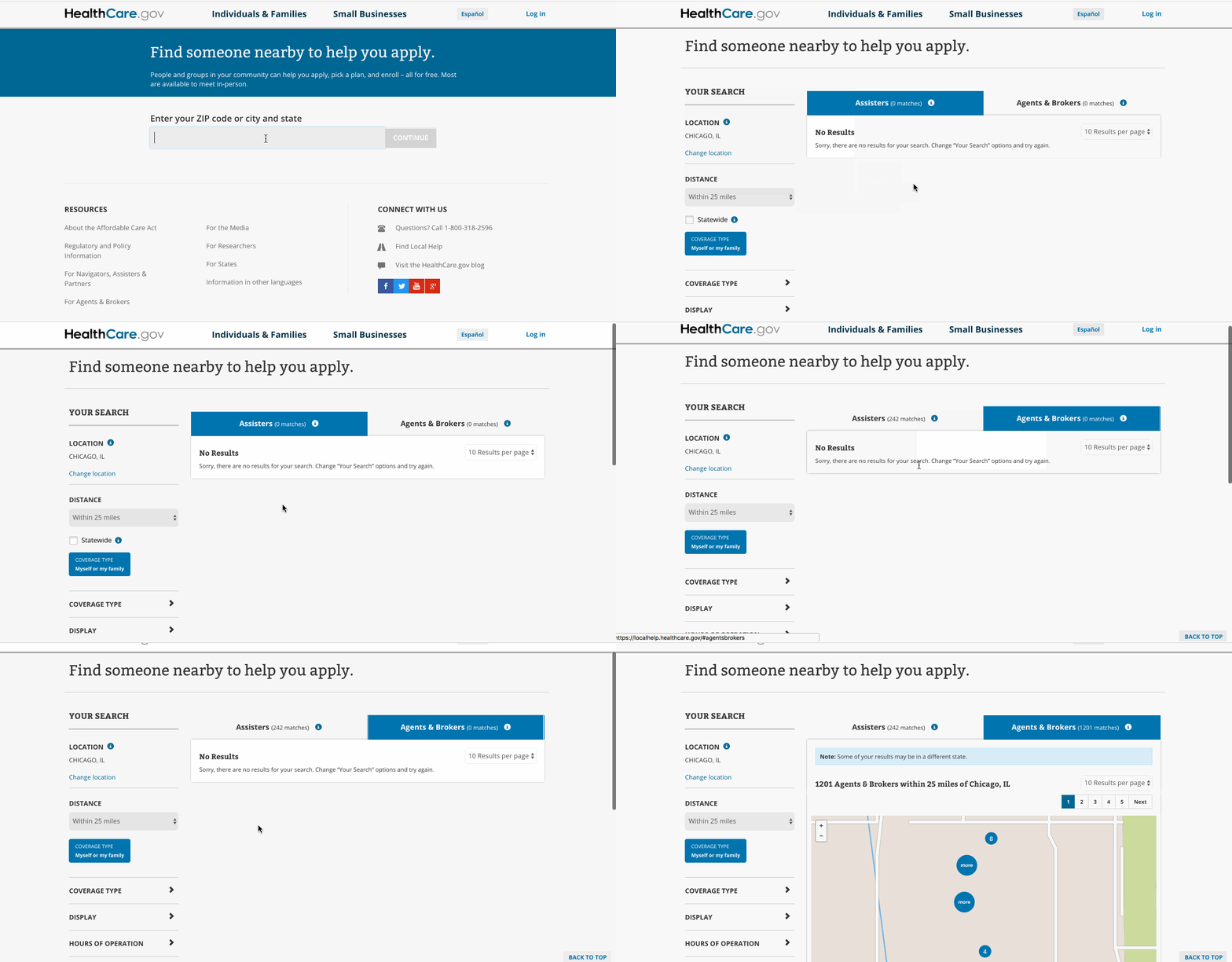
- A user interface designed for internal stakeholders

The redesign
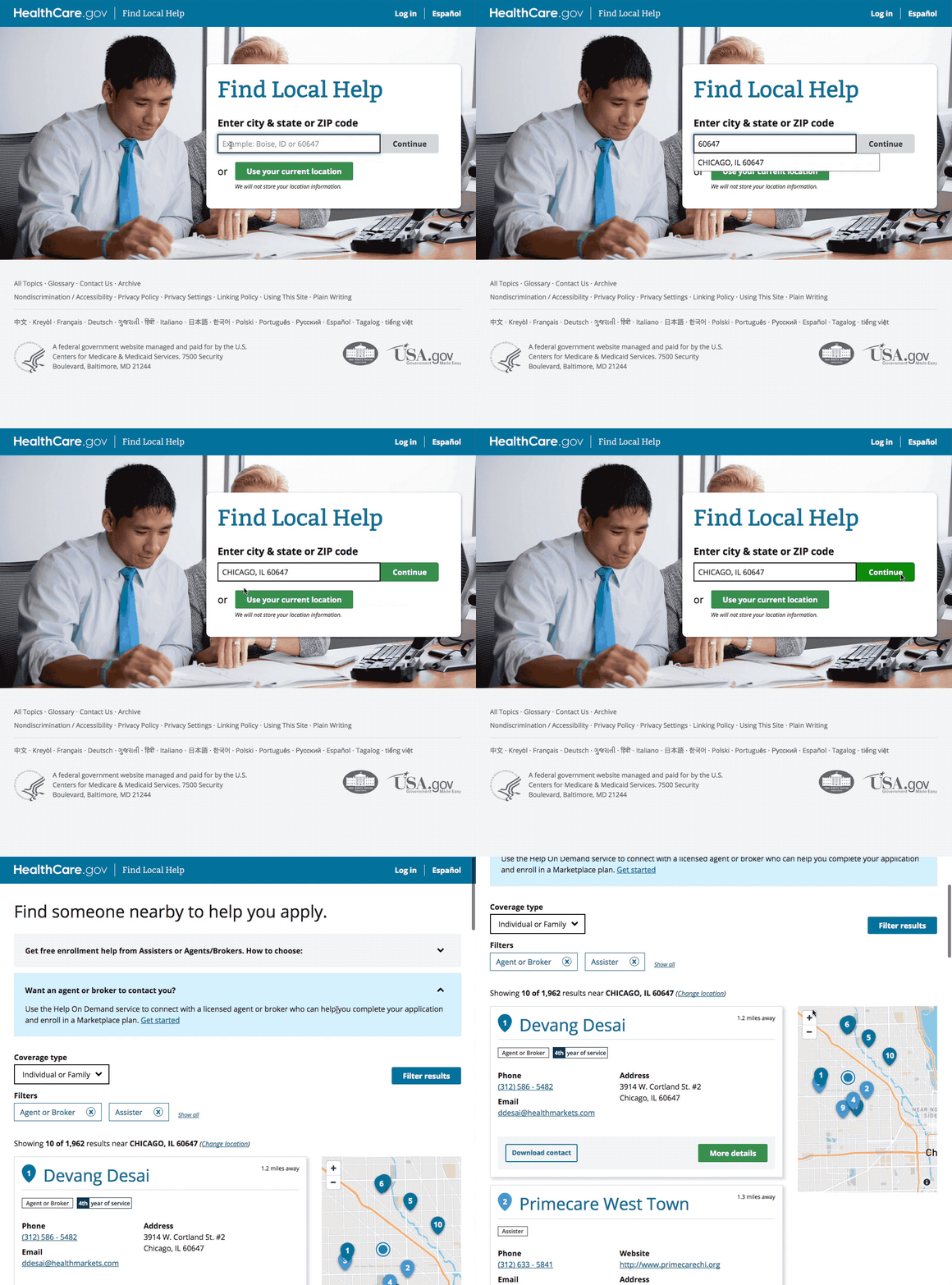
We first removed the extra questions between entering a location and seeing results. We then gathered examples from prominent search tools like Yelp and Google to show our stakeholders industry standards.
In the original tool's design, users received two separate lists of people who could help them: one for assisters and one for agents and brokers. Separating the search results into two separate lists makes sense for stakeholders, but for people who need one-on-one help, the priority is to get them one single list of everyone who can help.
We condensed the search results into a single page that includes clear explanations of the differences between available experts, understandable labels, and simple filters to let users see the list that's right for them. This makes the Find Local Help tool comparable to consumer search tools and ensures the design respects the circumstances users are in when they visit the site.

The outcome
While these changes weren't especially complex, they made a real difference in the experience for Find Local Help users by:
- Prioritizing users in the research process
- Using a human-centered design approach
- Deploying technical updates to speed up the search
Ad Hoc was able to help CMS better serve their users and strengthen this critical step in the process of getting health insurance.