Introducing a government design system for native mobile
With that in mind, we’ve created a version of the US Web Design System tailored to native mobile app development. We’re calling it the US Mobile Design System (USMDS). To be clear, this work is both unofficial and experimental. This is not owned or endorsed by the government, and will require a great deal of testing, iteration, and improvement to turn this into a mature resource.
As with all good open source resources, we hope that this project will get better with community feedback that will hone and sharpen our thinking, and further define the components and resources that are contained within the USMDS. Get started today with the USMDS on Figma.
Part of a larger story
Good design evolves over time to fit its context. Print design has evolved steadily for centuries into mature, shared principles for effective communication on paper. Web design, albeit a drastically newer medium, has undergone a similar maturation process, taking with it some of the best principles from print (like grids and typescales), while bringing new approaches that best solve the challenges that come from designing for a multitude of browsers, screen sizes, and operating systems.
Native apps have also charted a similar course, and designers have codified many established patterns, resulting in consistency that benefits users who come to understand and internalize these patterns over time.
The United States Web Design System (USWDS) has gained significant adoption since its introduction in 2015. Ad Hoc has been a champion and beneficiary of this meaningful work, helping apply USWDS components to early iterations of Vets.gov, later VA.gov, and HealthCare.gov and its CMS design system.
Technical considerations
This project exists as a Figma community asset. This is intended to drive UX and UI decisions and provide developer-ready design assets. While we’re hard at work continuing to build out our developer frameworks for mobile development, we plan to use the USMDS to advance the conversation around applying US government design principles to native apps.
Our approach
When possible, use native controls
When building a native mobile app, we believe that wherever possible you should use native phone controls. From button bars, to “share sheets” to dialog boxes, users have a high degree of fluency and comfort with these controls. In addition, there are often inherent benefits to using these controls, as both iOS and Android’s native controls enable assistive technology features out of the box.
Staying grounded in the fundamentals
While designing for native mobile might be new to many, the approaches we bring to design decisions remains the same. Being human-centered, grounded in research and product thinking, and thinking about an user experience that is accessible to the widest audience remain as important as ever. It’s tempting to add features to a native mobile app simply because you can, especially given the new features like haptics, biometrics, and location services that come with native app design. Thinking carefully about user experience and building features if and only if they maximize outcomes and deliver critical services remains as important as ever.
Adapting the best of USWDS
When there’s a need to go beyond native controls and applicable components exist within the USWDS, we’ve adapted these to fit for a native app. Sometimes this might mean shrinking the width of a component much like you might do with a responsive web design for mobile. In other cases, it might look like retooling the design or layout of a component entirely. In others, it means using only iterations of a component that have reduced information density, to ensure the information and user interaction can be easily understood and used on a small screen.
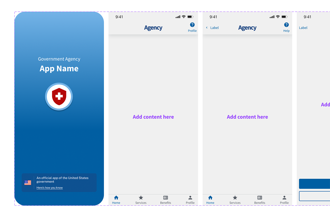
Where there is a need to create design patterns that are unique to native mobile, we’ve made a start creating some of the most used design patterns, including a splash screen, button bar, and native app banner, taking some of the best of our lessons learned building native apps for federal customers.

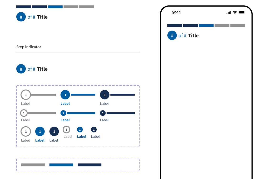
Progress component: Taking the best of USWDS and applying the most applicable versions of a progress component to a native app context. This means using versions that have less information density while still conveying valuable information to a user.

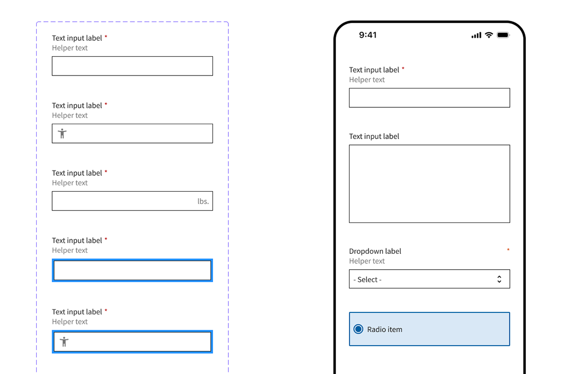
Form fields: We believe that if an existing USWDS component works well in a native context, and is not handled well by a native control, then using the best of what USWDS has to offer makes sense.

Native-specific components: Some user interactions are unique to native mobile: Case in point: Application splash screens. We’ve made some strides to create an initial set of components, but we also recognize that there’s plenty of work to do to mature and grow this set of design elements.
Standing on the shoulders of others
This work would not be possible without the incredible stewardship of the USWDS over the past nine years, and for that we — and many others — are very grateful. This work would not have happened without the advocacy, vision and support by both the General Services Administrations’ Technology Transformation Services and the U.S. Digital Service, as well as the tremendous work agencies have accomplished in implementing and furthering USWDS into live, functioning websites across the federal government.
We look forward to a future when native app standards have a similar home and level of oversight within the government, and hope that in some small way our work helps further the conversation in that direction. In the meantime, we’re excited to see how people take this Figma community project and extend it in ways we haven’t yet explored.
Related posts
- Using design systems for digital success within the federal space
- Imagining an app to simplify student loan forgiveness
- Design systems in government: How to ease handoffs
- Design systems in government: When to start
- Design systems in government: Improving documentation for better collaboration
- Design systems in government: Communication is critical
