Become a champion for Section 508 compliance by using annotations
Designers can live in the visual world of user interface (UI) design without often considering what’s under the hood.
Sure, most of us have an understanding of markup and styles and the things that can affect an app or a site’s performance. But many designers rarely think about HTML code and content from a semantic (containing meaning rather than only appearance) perspective or how keyboard and non-sighted users experience web pages. This should change.
As designers, we can step up our game by creating annotations – simple callouts that communicate intended content structure, tab stop order, and screen reader notes – in our mockups that help ensure our products are built as intended and meet Section 508 guidelines. Doing so helps us serve all of our users by providing a blueprint for better user experiences.
What are accessibility annotations?
Deque, the same company behind the axe testing tool, offers a downloadable annotations toolkit with files for Adobe Illustrator and Sketch as well as individual SVGs. The library contains symbols that call out headings, tab stop order, and screen reader notes, among other things. A designer can place the symbols into their mockups just as they would add annotations that detail interaction design behaviors in the UI. The annotations communicate the intended experience for keyboard and screen reader users. Doing so helps eliminate ambiguity – developers can code a page according to a designer’s notes, just as they would when implementing the visual design.
How we use annotations to make interfaces accessible
Too often, accessibility compliance can be a last-minute consideration, when ideally it should be baked into a team’s design and development processes. Designers at Ad Hoc use annotations to help socialize accessibility compliance throughout the external teams we consult. Bubbling up “unseen” behaviors and interactions through the annotations has the dual effect of guiding development and putting accessible, compliant design on the radar.
For teams that already have a review process incorporated into their cycle, the annotations speed up the QA and design review process. Engineers, QA, product managers, and other designers no longer need to guess what a designer’s intent is – they can follow the annotations to get a sense of the keyboard and screen reader user experience before any code has been created.
One of Ad Hoc’s teams began instituting annotations on a consistent basis in late 2022. This was part of a larger initiative to create a formal process where designers meet with an accessibility compliance specialist to talk about their design intent, review the visual mockups together, and discuss the user experience for keyboard-only, low-vision, or non-sighted users. The goals of this review are to:
- Reduce developers’ guesswork and assumptions by providing guidance for semantic HTML and UI interactions. By doing this, we reduce bugs being introduced in production.
- Push designers to think about accessibility requirements earlier in their designs — considerations are incorporated holistically rather than as an afterthought.
- Provide an educational opportunity for product managers, designers, and developers by helping them better understand semantic HTML and the experience of a broad range of users.
On another contract, we use annotations to make the most of design review meetings. In these meetings, designers get the opportunity to discuss their intended user experience and visual mockups with an accessibility compliance specialist before high-fidelity prototypes are made or any code has been written.
Getting started with annotations
When designing, it’s important to consider the needs of all users. To do this, consider adding annotations with notes or instructions to help the user interfaces work for people who rely on assistive technologies like screen readers.
This is helpful because:
- It gets you, the designer, to think about the user experience of those who use assistive tech, a mouse instead of a keyboard, etc.
- Documenting these requirements also provides clarity for engineers and stakeholders so that there isn’t any guessing of intention on their part.
When one of our teams meets for a Design Accessibility Compliance Review, our annotations actually begin in text format within a document such as a Jira ticket or Google doc. A great example that we use as a reference is this accordion pattern documentation from W3C. While we discuss the visual and interaction designs, we list things like:
- Semantic headings in the design
- Page titles (especially considering state and content changes)
- Accessible names/labels of UI elements
- Focus (tab) order of interactive elements
Below is the template we use in the Jira ticket to facilitate design accessibility compliance review discussions while reviewing the visual mockups. You can copy, paste, and then edit this template in the “Description” section of your own Jira Design Accessibility Compliance Review ticket.
Name of the item to be reviewed:
What is the name of the thing you’re building?
Briefly describe the purpose or goal of this feature/interaction:
Your brief description here.
Annotations
Feel free to lay this out here or we can discuss it together.
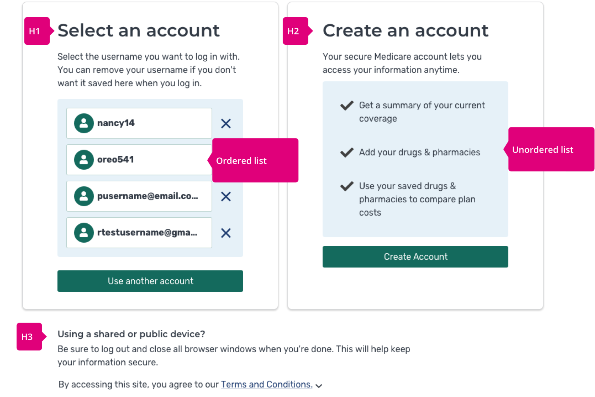
Headings
This declaration of headings is meant to define the semantics of the element and not the classes and visual styling of the headings. (If you don’t understand the purpose of headings and html structure then it may be useful to read this helpful article on heading structure.
Note: If alerts will be displayed after a user’s event, those should be taken into account for the html heading structure as well.
Example heading structure:
H1 - My Favorite Recipes
H2 - Quick and Easy Recipes
H3 - Spaghetti
H3 - Tacos
H4 - Fish Tacos
H4 - Black Bean Tacos
Page Title(s)
See this resource from 18F. As a user goes from page to page or if significant content changes occur on a page, we need to define the page titles.
- Define page titles. Loop in the Content Team for this.
- List out page titles here or link to another doc that contains them. The Accessibility Compliance Specialist will use this info in QA.
Focus order
Add mockups or list here what you think the focus order should be.
Accessible names/labels
Define any accessible names of elements here, if needed.
Designer’s checklist
Some other points to think about ahead of time. Check off ahead (if useful) when you’ve considered them. Feel free to use this as starting points for documenting the experience above.
- Do you need to define a page title?
- Do you need alt text for images (including icons)?
- Do you have mobile/responsive considerations?
- Have you considered focus management and focus order? We should document for the devs what the tabbing order would be for a keyboard-only user. Defining your expectations for this can be helpful for the devs when they build the structure of the elements.
- You should have an opinion on heading hierarchy (h1-h6)—not font-sizing, but actual hierarchy.
- Have you checked color contrast for at least 2.1 AA acceptable rating?
- Should you document screenreader text or alt text for developers to use?
- Would extra screenreader-only text be helpful for users? Don’t overdo this—and simply create noise for the user—but consider the non-visual user as well.
- Will aria-labels be used? What should that text say?
- What if there are slow (network/cellular/wifi) connections for the user?
*Template created by Ad Hoc designers David Kennedy and Dan Bivins.*
After this review is completed, the designer can then move the text-based annotations to a visual format in Sketch or even just hand off the text-based version, depending on what is best for the team and situation.
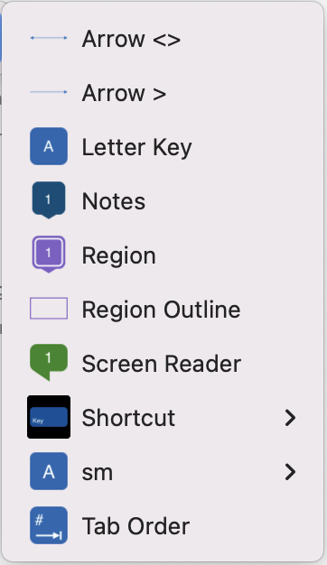
In one scenario with a different customer, our designers start off by adding an annotations library from a shared Sketch for Teams workspace. The library contains visual annotations that convey the expected semantic structure, keyboard navigation order, and screen reader UX for keyboard and screen reader users. Using the Insert/Symbols menu in the Sketch desktop app, a designer can easily navigate to the accessibility tag they need and insert it into their mockup.

HTML annotations

HTML annotations are notes or comments that are added to HTML code to provide additional context or explanations. To improve the design hand-off process, use the callouts sparingly to communicate design decisions or requirements to developers, or to provide instructions for how certain elements should be implemented.

Repeated UI elements, such as navigation, that behave the same way between screens may be tagged once or not at all, depending on your use case. It’s always a good idea to collaborate closely with the developers and accessibility specialists early in your process. Ask what kind of tags will help them to implement or review your work.
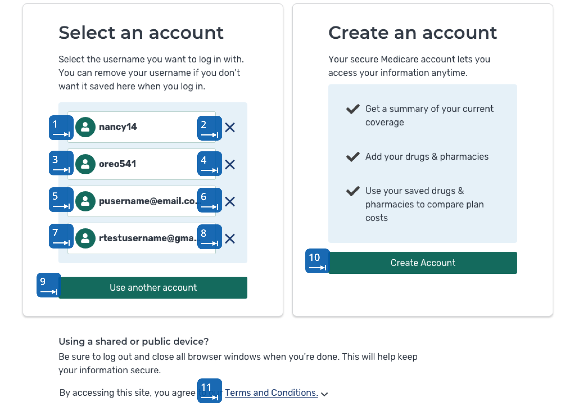
Focus order of interactive elements

Ensure the correct implementation and accurate reflection of the original design intent by calling out the focus order. Interactive elements, like buttons, links, and form fields, must have a logical and intuitive focus order to improve web page usability. This also improves overall accessibility and usability for all users.

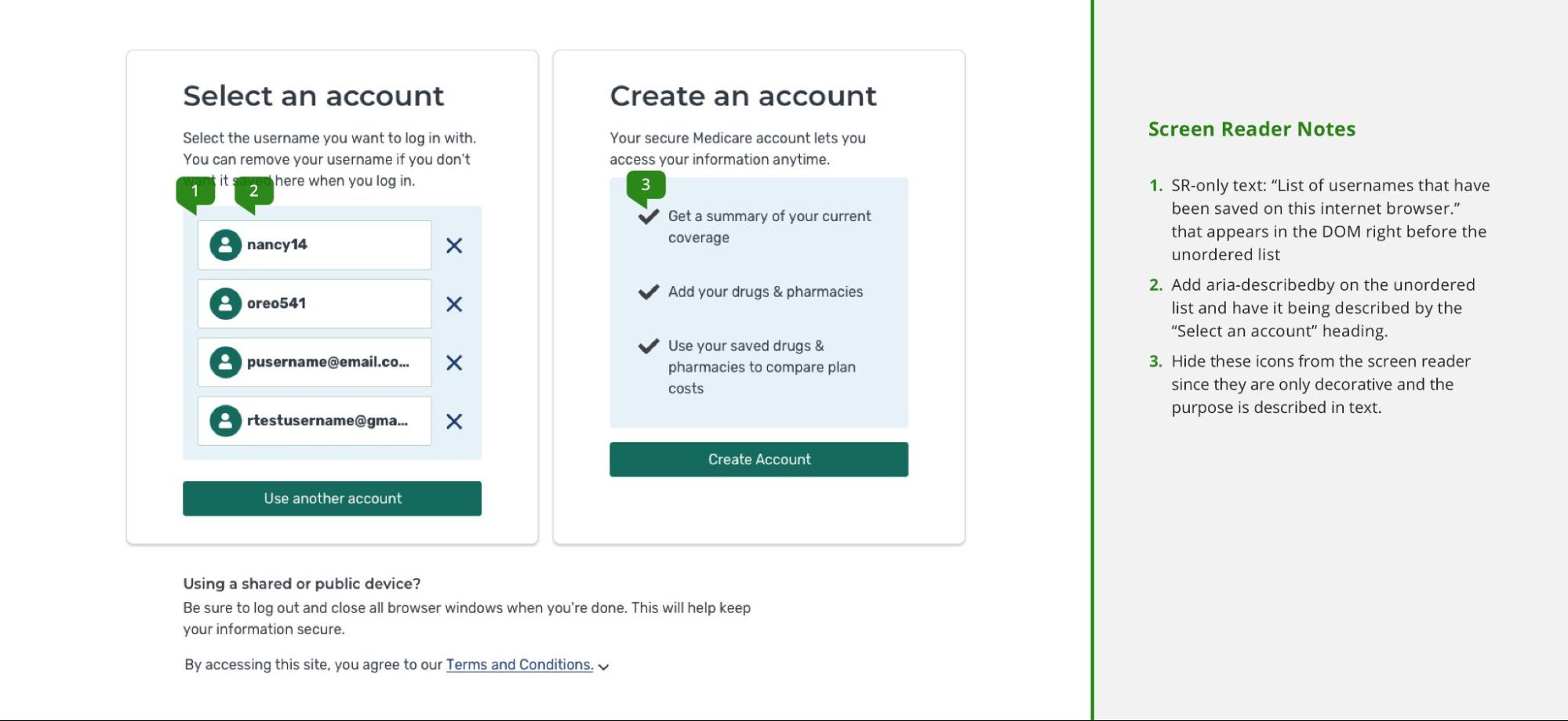
Screen reader notes

It’s important to ensure that design notes for screen readers are clear, concise, and easy to understand, as screen readers will read them aloud to users who rely on them. Be mindful of the limitations of screen readers and consider how users who rely on them will experience the design.
Design notes can include information about the purpose and behavior of elements, instructions for how certain elements should be implemented, or explanations of complex interactions or layout changes.

Using annotations to improve everyone’s experience
Annotations belong in every designer’s toolkit. They offer a way to socialize best practices and surface the experience of screen reader and keyboard users in a way that easily integrates with the design process. With annotations, it’s now easier than ever for each of us to become an accessibility compliance champion.


