Giving data a soul: Using human-centered design to create powerful data visualizations

Data visualizations are a crucial tool to help us make sense of the massive amounts of data out there, but how many times have you seen a data visualization that
- You couldn’t understand?
- Required your own analysis to make anything out of it?
If you’re not creating data visualizations with your audience in mind, then it’s likely they’ll remain unused. Leveraging a human-centered approach in digital services allows user experience (UX) practitioners to design experiences that meet users’ needs. In some ways, designing data visualizations with a human-centered approach will feel similar, but there are a few additional considerations for each step of the process.
- Empathize: Consider the context and your audience
- Define: Choose the right visualization
- Ideate/Prototype: Eliminate the clutter and focus attention
- Test: Iterate and get feedback
- Implement: Tell a story
Empathize: Consider the context and your audience
Gaining empathy for your users is not exclusively for UX practitioners. We can all apply this critical step when setting out on a data visualization project. Often, when someone needs a data visualization, the process might start with a complicated spreadsheet that’s riddled with missing data, inconsistencies, and difficult-to-manage open text fields. Additionally, there’s often no insight into how someone might want to use this data.
This is where empathy building comes in. For all my fellow data nerds, we need to resist the urge to dive straight into the data to clean it up and uncover trends. Instead, let’s take a step back and ask open-ended questions.
Create an opportunity to engage with your stakeholders and the target audience about your data visualization – just as you would when designing any other digital experience. Gaining perspective with some of the following questions can drastically change the impact your data has on the people who are meant to consume it.
- Who will be consuming this data?
- What problem(s) are they hoping to solve?
- How are they currently solving these problems?
- What actions do they hope to take based on the data?
Throughout the process, continue to come back to the answers to ensure the data visualization will meet the needs of both the stakeholders and target audience.
Define: Choose the right data visualization
Frequently used chart types include bar charts, pie charts, and line charts. The options don’t stop there though. Sites like DataVizProject highlight over 150 chart options, which can be overwhelming.
So when it’s time to decide how to visualize your data – something that can often be clouded by personal preference or organizational culture – we want to make sure we’re considering our audience. Thankfully, there are more tangible ways to make sure you’re choosing the chart that most accurately and effectively communicates your data’s message.
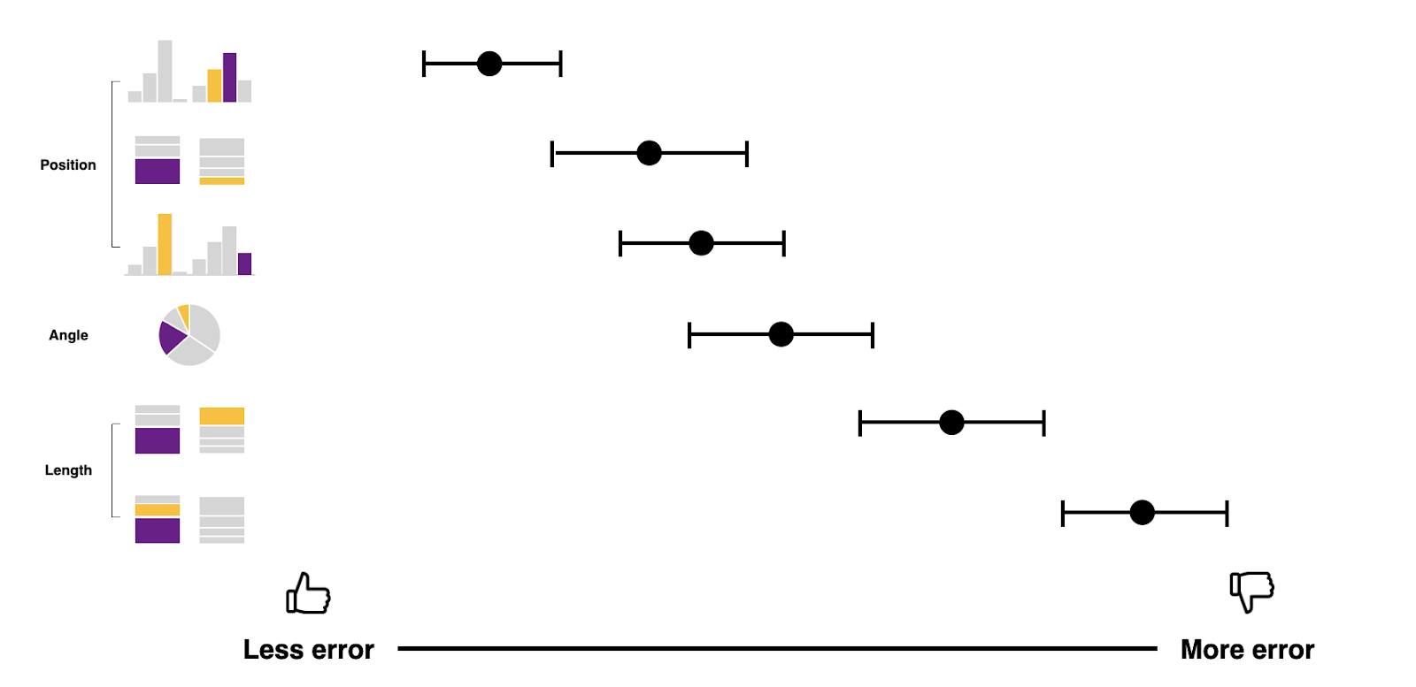
A study in human perception of graphics
William Cleveland and Bobby McGill’s 1984 graphical perception study helps us do just that. Their goal was to see how well participants could compare data points in different types of charts. They categorized these different types of charts not by bar chart, pie chart, or line graph, but by the task that our brains are doing to perceive and compare the data points.
The results of their study showed that when comparing data points on a common aligned scale (e.g. bar chart or scatter plot), participants exhibited the least amount of errors. This study was repeated in 2010 with similar results. Based on these studies, we know that if our audience needs to make accurate and precise comparisons across the data, we may not want to display our data in a pie chart. Instead, we should consider a bar chart.
When we take the time to understand the data’s context and purpose and the nuances of human perception around data visualization, we’re able to design data experiences that are more usable and understandable.
Ideate and prototype: Eliminate the clutter and focus attention
Once you’ve decided on the best type of chart to represent the data, then comes the fun: ideating and prototyping the data visualization. Before you jump into your favorite tool, though, I always recommend going back to the basics and sketching out preliminary chart ideas to make sure the data can be represented effectively. And always remember: when it comes to designing data visualizations, less is more.
Eliminating the clutter
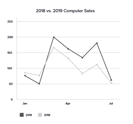
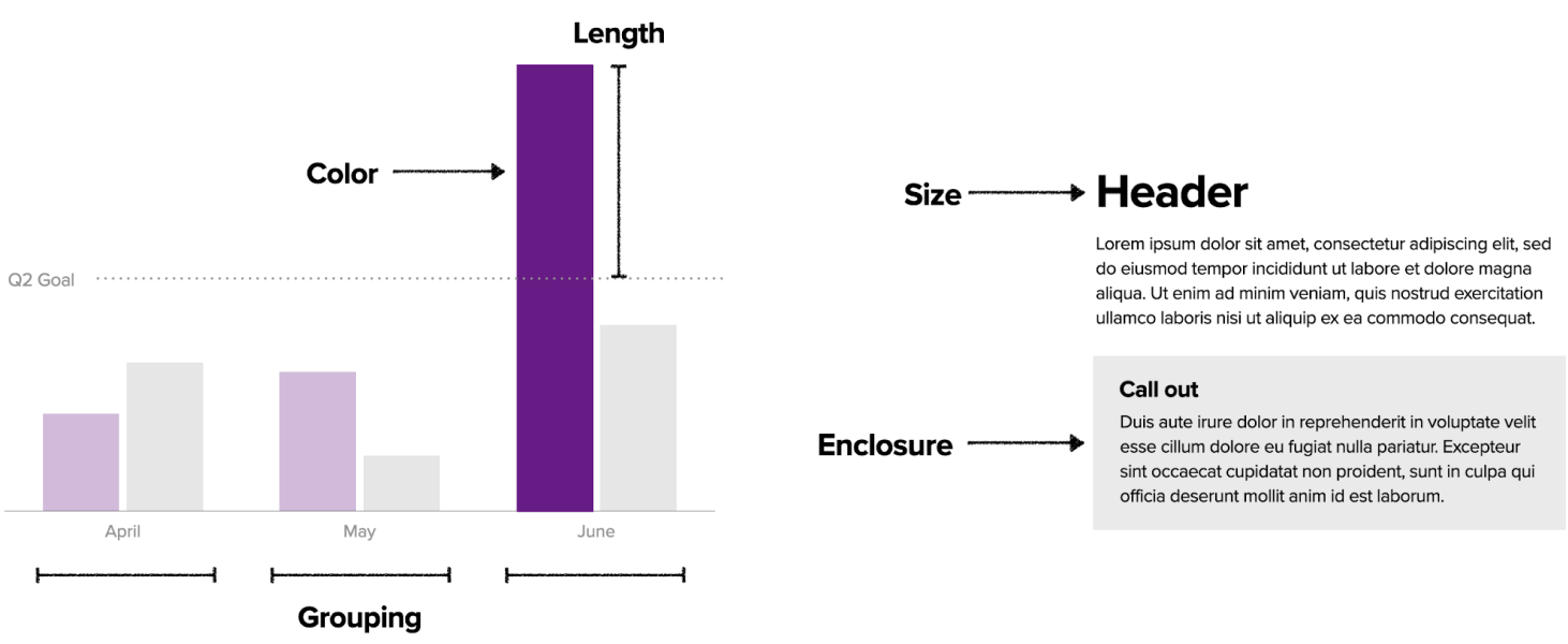
Chart junk, a term Edward Tufte first coined, is any unnecessary element of a chart that doesn’t help the viewer comprehend the content. We’ve all probably seen charts that contain too many visual distractions that make it difficult to decipher the meaning.
The story of the data behind these visualizations gets distorted by extra visual elements and color. Avoiding unnecessary elements will help us paint a clearer picture of our data and the story we’re trying to convey. Here are a few guidelines to eliminate clutter in your charts:
Reduce colors and extra weight
Do:
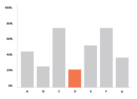
- Use color to bring attention to what matters most
- Minimize backgrounds, borders, and special effects
- Bold the most important information to guide the eye
Don’t:
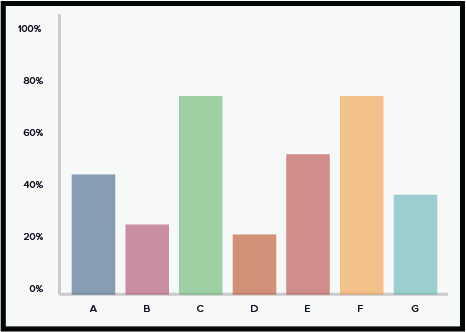
- Use random color for every item
- Bold information and elements that distract from the chart’s primary purpose
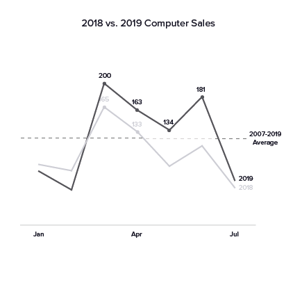
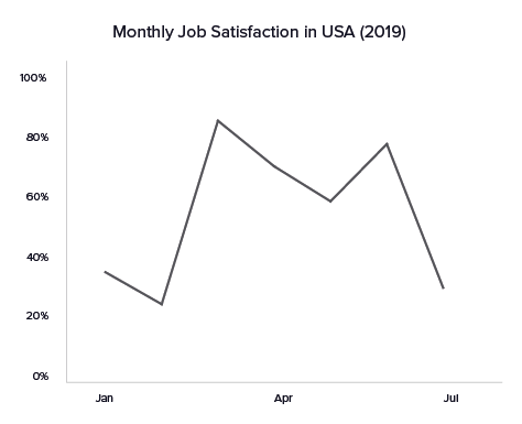
Remove gridlines, and label data directly
Do:
- Label data directly instead of using a legend or extraneous gridlines
- Use gridlines sparingly
Don’t:
- Use data markers unless accompanied with a data label
Create simple axis labels and descriptive titles
Do:
- Be specific when choosing a tile to describe your graph
- Choose consistent and logical breaks in the data for labels
- Use common abbreviations for labels (e.g. Sun, Mon, Jan, Feb, etc.)
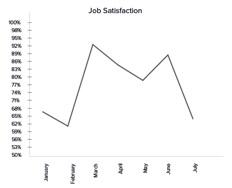
Don’t:
- Place labels at any angle because this makes reading them very difficult
- Use axis tick marks
- Start a numeric axis on something other than 0
Focusing attention
Without the clutter, now we can focus the audience’s attention on the right data points. We can do this by leveraging preattentive attributes, which are different properties that our brains unconsciously process to help us comprehend what we’re seeing. In the design world, they’re similar to Gestalt’s Principles. Below are the 8 preattentive attributes that we can use to draw attention and compare or contrast certain aspects of a visualization.
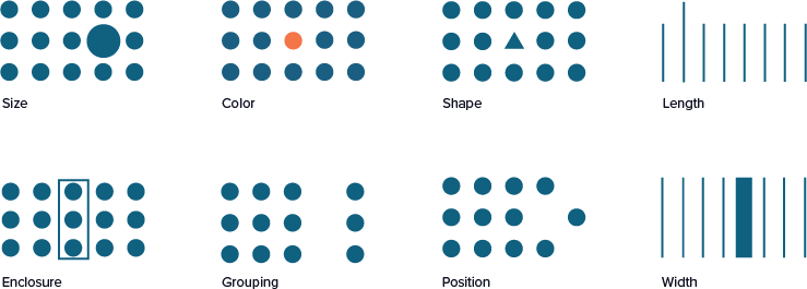
In these terms they may seem unfamiliar, but we see them in charts and text every day.
Test: Iterate and get feedback
You can use the same usability testing principles for websites and mobile apps to test the effectiveness of your data visualization. But in addition to testing the usability of the visualization, you’ll want to evaluate how well participants comprehend the data they’re viewing. Here are some questions you could ask.
- What conclusions can you draw from the data here?
- What does the data mean to you in your current role?
- Is there data that you were expecting to see but don’t?
- What actions are you able to take based on the data you see here?
Based on what you uncovered during your initial research, you will want to validate that the data visualization enables those decisions and actions. If the users aren’t sure what they could do with the data as you’ve presented it, or they say they just want to pull it into a spreadsheet to manipulate for themselves, then your job is not yet done.
Implement: Tell a story
When you’ve walked through the human-centered design process with your data, you should end up with data that’s ready to tell a compelling story. In Storytelling with Data, author Cole Nussbaumer Knaflic explains how storytelling enables us to effectively communicate our data so that our audience can easily recall it. Whether we’re relaying it verbally, in a presentation, or through a dashboard, our data can follow the same beginning, middle, and end structure of a story.
In the beginning, set the stage by providing context for the data, the main “characters” of your data story, or the problem you’ve set out to solve. In the middle of your story, dig deeper into the data comparisons, examples of the problem, or predictive trends. The end is often a call to action or at least a call to understanding. In a dashboard, this might look like a clear navigation flow through multiple layers of visualizations, or it might indicate how a user can interact with the visualizations.
No data story is complete without including a bibliography of the resources you used to tell that story. Even when we’ve created a story with compelling data, folks can still feel skeptical of what they see. Help them gain trust and confidence in your data by providing details about who analyzed the data, definitions for acronyms and unique terminology, source links to referenced data, explanations of calculations being made or data that is missing, and any data clean-up performed.
Creating a soulful data experience
The human-centered design approach to data visualizations will help you create the most effective visualizations no matter your target audience. If we look back at our design process, we see how each one can be further adapted for data visualizations:
- Empathize: Uncover who is using your data and how they need to use it.
- Define: Leverage what we know about how your users perceive different types of charts.
- Ideate/Prototype: Keep it simple.
- Test: Test your visualization for comprehension in addition to usability and accessibility compliance.
- Implement: Ensure your data is telling a story that can evoke action.
Brené Brown tells us that stories are just data with a soul. Start with the data and leverage the human-centered design process to truly bring that data to life.
Related posts
- The right benchmarks
- The new Ad Hoc Government Digital Services Playbook
- Four myths about applying human-centered design to government digital services
- Navigating government barriers to human-centered design
- Human-centered design helps government make better decisions
- Using human-centered design to improve customer experience: an AFCEA discussion