Supporting the busiest time of the year for Medicare beneficiaries
One of the most important decisions a Medicare beneficiary makes every year is what Medicare plan they enroll in. Whether it’s a mix of Original Medicare, a Prescription Drug Plan, Medigap, or a stand-alone Medicare Advantage plan, this choice determines the beneficiary’s coverage as well as their costs for health care and drugs. This choice impacts their health and drug coverage, financial standing, and peace of mind.
Beginning October 15, Medicare beneficiaries enter their Open Enrollment (also known as Annual Election Period), in which they’re able to browse which Medicare plans will be available for the next calendar year, compare, shop around, and ultimately enroll in that plan. Here at Ad Hoc, we built and run the tool that allows this to happen: Medicare Plan Finder.
With support from Ad Hoc, the Centers for Medicare & Medicaid Services launched a revamped Medicare Plan Finder last year and successfully completed the first Open Enrollment with the new tool, which:
- Helped more than 2.6 million Medicare beneficiaries enroll in a Medicare plan, about 40% more enrollments than the legacy tool the previous year
- Observed an average of 373,000 visitors a day
- Experienced zero downtime, meaning the tool ran smoothly and did not impact an individual’s ability to find and enroll in Medicare
But here at Ad Hoc, we strongly believe that there is always room to gather feedback, learn, improve, and iterate. As we closed out our first Open Enrollment period supporting this tool and look towards our second, it was crucial for us to support CMS to better understand how people really used Medicare Plan Finder. We wanted to gather feedback, explore areas of improvement, and think through what are the highest impact changes we could make to ensure an even smoother Open Enrollment.
The feedback we gathered led us to focus on three main categories:
- User-facing improvements. Assessing and implementing ways to improve the user’s experience while going through the tool.
- Behind the scenes improvements. Reducing system complexity and improving system resilience.
- Open Enrollment traffic preparation. Ensuring we’re able to handle the significant increase of traffic to the site during Open Enrollment.
User-facing improvements
At the end of the first Open Enrollment, we received feedback from beneficiaries, those who help them, industry stakeholders, advocacy organizations, and many more on what they appreciated about what we built but also different ways we could improve the tool. User testing sessions run throughout Open Enrollment enabled us to see how people actually used Medicare Plan Finder — where things went smoothly, where they got stuck, and ways we could improve. Along with our customers at CMS, we collated all of this feedback and had many in-depth conversations around the following criteria:
- What were the core problems and concerns being called out in this feedback?
- What are different ways we can address these core problems and concerns?
- Which features or improvements will improve the experience for the majority of beneficiaries?
- Which features or improvements are technically feasible to complete given other work that must be completed?
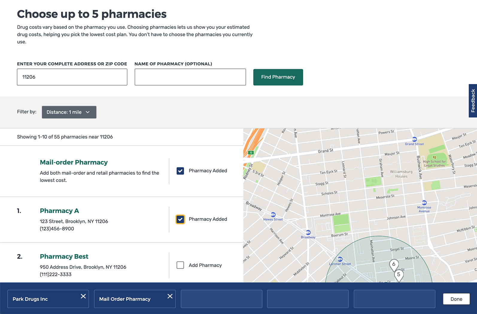
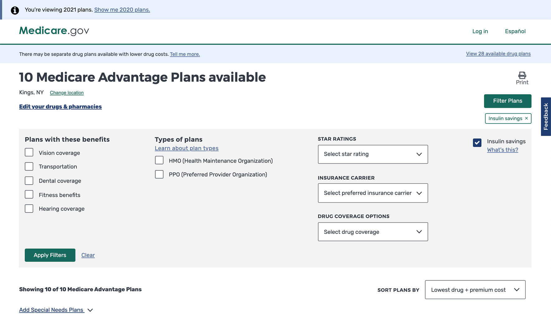
Using these criteria as a framework to process the feedback that we received, we worked with our customers at CMS to implement a list of features and improvements that will significantly improve the experience for beneficiaries during this year’s Open Enrollment. This includes improvements to how people search for and select pharmacies and updating the default sorting to be by plan premium plus total drug cost without negatively impacting performance.

Behind the scenes improvements
With any software or technology, there is always room to make things run smoother, build more resilience into your system, and reduce complexity so that the user-facing experience is as seamless as possible. As we stepped out of our first Open Enrollment, we knew there were distinct areas where we could make improvements to the system that would pay dividends to the user. While users may never see these improvements when they look at the site, they would allow us to serve information to them faster, troubleshoot issues even sooner, and improve the overall resilience of Medicare Plan Finder. Similar to the user-facing improvements we made, we asked ourselves a series of questions to determine which areas to tackle first:
- Will investing time into this area vastly improve how we serve our users?
- Will this allow us to more quickly identify and triage issues?
- Will this feed into our longer-term goal of building a resilient and sustainable tool?
By asking ourselves these questions, Ad Hoc and our customers at CMS were able to sift through a large list of potential work items into key items that the team worked diligently to get into place for our second Open Enrollment. A few key examples include:
- Building more robust and stable integration tests. Any resilient system has built-in integration tests that allow for automated tests of different user flows to run at any given moment, allowing a team to quickly identify any areas where a bug or issue could be. For example, if a “Next” button suddenly becomes unclickable, an integration test would pick that up and notify our team immediately, so we can fix it before the code is ever deployed to a user. Medicare Plan Finder has 3 key user experiences and endless amounts of variations of how users can navigate and use the tool. Having watched and gathered data on the different ways that users interact with Plan Finder, we adjusted and built a more robust set of integration tests that would be able to catch if a key point of the user experience is not acting appropriately.
- Improvements to how and when we get alerted of issues. A complex system like ours has a lot of moving parts, and you can instrument the system to alert you if something goes wrong. But figuring out when to raise an alert is the hard part. Too many alerts and you get a lot of noise to sift through and run the risk of alert fatigue. Too little and you miss on an important breakage. As we’ve observed how users interact with Plan Finder and the ways in which our systems interact with other systems in real time, we’ve continued to refine our list of crucial alerts that really tell us “something is wrong with Plan Finder.” This allows us to put on our investigation hats and resolve the issue as quickly as possible.
- API and database performance improvements. Medicare Plan Finder consumes and displays a large amount of information. During Open Enrollment, we display two years worth of plan data (thousands of plans, each with hundreds of individual pieces of information), we consume raw drug and pharmacy data so that we can translate that into estimated yearly drug prices, and also consume and display information about beneficiaries when they are logged in. Safe to say, there is a lot of raw data to ETL (extract, transform, and load) so that we can present it to the user in a coherent way. For our second Open Enrollment, we wanted to ETL this information ever faster than our first. We invested heavily in improving our ETL process so that getting the information from its raw form into our API so our front-end could display that information went from hours to minutes. This is crucial because when we need to update information, we are able to do it quickly to ensure we’re always providing beneficiaries with the most up-to-date information and build resiliency into Plan Finder.

Prepared to handle the traffic
Open Enrollment is when Medicare Plan Finder, and Medicare.gov overall, sees the most traffic. Last Open Enrollment, the tool had an average of 373,000 visitors a day and experienced no downtime. However, we know that with each year, our customers at CMS, other organizations, and media outlets will be pushing for more and more people to use Plan Finder as the way to find and enroll in a Medicare plan. Also, our traffic is wildly variable, as beneficiaries crowd the site at the beginning of open enrollment and right before the deadline. Given this, it’s always important to us to ensure that our system can handle well above that level of traffic. That’s why we invest heavily in load tests — simulating well above the level of traffic we expect on our tool during the busiest day of the year to see how the system performs. This allows us to:
- Looking for points of brittleness. Push our system to see where there are points of brittleness — where something falls apart that breaks the user experience or does something we would not expect — and investigate ways to address that brittleness.
- Testing our various integration points. Medicare Plan Finder is a web of various systems connected to one another to provide the experience that beneficiaries see. Plan Finder integrates with numerous systems to support key functionality like displaying the data we need, supporting our authenticated experience, or processing the enrollment applications. It’s crucial that we test that these integrations point not only work, but that they too are able to handle well above the level of traffic we suspect. If one system fails, it’s a domino effect that ultimately impacts the user. This allows us to identify areas where our partner integrations can also work to improve in collaboration with us.
- Ensuring we can handle a large number of applications. Finder relies on other systems to round out our entire experience. The most important of all is the ability to process enrollment applications. We do a specific load test for our enrollment applications to ensure there are no hiccups when tens of thousands of beneficiaries submit their application at once.
Walking into our second Open Enrollment as prepared as we can be
You can plan and build for all the scenarios you can think of, but something unexpected always happens. That’s the nature of building robust and complex government digital services that serve millions of people, and just life in general; you plan and when something unexpected happens, you adjust. Here at Ad Hoc, we prepare our team for the unexpected by practicing how we work as a team and communicate when the unexpected inevitably does happen. We run numerous Game Days throughout the year where we break things and train the team on how to respond, how to investigate the issue, and how to solve the issue. This helps to prepare us mentally for the reality that things break, and that’s okay. What’s most important is how you respond and resolve the issue.
So as Ad Hoc walks into our second year of supporting CMS and Medicare through Open Enrollment, we have built more resiliency into our system, made improvements that will ease the user experience, and are prepared as we can be. We’re looking forward to helping millions of people search, compare, and ultimately enroll in a Medicare plan that will best meet their needs for 2021.
Related posts
- Ad Hoc, Fearless, and Ellumen win contract to continue support of Blue Button 2.0
- Prototyping a COVID-19 vaccination verification app
- Prototyping a COVID-19 vaccination verification app
- Modernizing how Medicare beneficiaries find and enroll in coverage
- With existing tools, the IRS could connect people with healthcare
- Three Ad Hoc-supported projects win FedHealthIT awards
