Why design skills are a power-up for researchers

Many of us have been in this position. Sometimes your stakeholder doesn’t even wait until the end of testing to ask for results. Your instinct might be to quickly type up a report, throw some quotes in there, and email it over as fast as possible. But is that the most effective way to get research results out? Words may be faster, but taking the time to visualize your findings through design can have a greater, longer-lasting impact.
Figuring out your research questions, finding participants, and doing the research are only part of the challenge. Perhaps the most significant work comes when you need to figure out how to actually tell the story of your research. You could have the best research study of all time, but it won’t matter if you can’t get your stakeholders to take action on your findings.
Figuring out how stakeholders like to receive information
Presentations and reports are often the way UX folks deliver research results. Researchers may feel more comfortable with the written word, but this may not always be the best way to tell the story of your findings. Your stakeholders are the users of your research; you need to tailor the experience to best suit their needs.
Approach it like another research question. What has your time with them told you about how they consume information? Maybe your stakeholder has a lot on her schedule. You’ve had a hard time getting her to come to meetings because she’s always triple-booked. She’ll appreciate something she can review on her own time instead of a 45-minute presentation. Perhaps you’ve heard another stakeholder complain about all the spreadsheets and reports he has to read; writing up a 20-page document probably isn’t a good use of your or his time.
Your business analysts, product manager, or delivery manager will have good input here, too, as they may work with your stakeholders more closely on a day-to-day basis, or have known them over a longer period of time.
Visualizing research through design
In my experience, visualizing research results can have a big, long-lasting impact that a written report or a Confluence page won’t. For example, posters can be hung in hallways, meeting spaces, and used in workshops. Stakeholders can glance at a user journey and see right away all the spots that need to be fixed, or lean in close to read specific details about users’ experiences. A chart or diagram in a presentation can get your point across more quickly than a list of bullet points. I’ve even modified wireframes and screen designs to illustrate what a recommendation would look like, just by adding text boxes or other basic shapes over the existing design.
For example, here is a user flow written out in text:
Steps to upload a file:
- Upload files to PROD folder
- User quote: “SFT is like a toddler sibling…we’ve gotten used to its fits.” - Support Contractor
- Receive email notification of upload
- If file fails to upload, return to step 1.
- Pain points: difficult or confusing system, excess wait time, duplication of effort or data
- If file fails to upload, return to step 1.
- Receive email notification of acceptance
- Pain point: excess wait time
- Finding: Second email may not go through.
And here’s the same information visualized using a simple flow chart template in Miro:
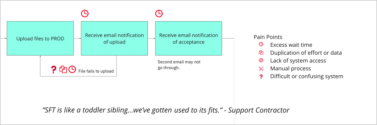
The visualized example not only takes up less space, but it’s also easier to parse. The viewer can more quickly see where specific pain points are and where process steps may repeat. If they’re worried about wait time, they can just scan for the clock icon. If they want to know where users may need to repeat work, they can look for arrows that return to previous steps or look for the duplication icon.
A good design does not need to be complicated to be effective, it just needs to be clear.
In the Hospital Quality Reporting program at the Center for Medicare & Medicaid Services, we use large-scale diagrams at our in-person planning events to both show off the work we did and to gather more insights from our stakeholders. In the past year, we’ve shown our roadmap for the project, a typical user journey, new screen flows, and quotes from users. The diagrams are large enough that you can’t help but notice them, and by positioning ourselves right by the entrance, we get a lot of stakeholders stopping by to look at our posters (giving out candy also helps). We have Post-it Notes and Sharpies at the ready to mark up our diagrams with any questions or corrections. These diagrams have helped explain the value of UX to our stakeholders and given us a chance to build relationships while getting new research insights from their expertise.
Learning how to design
Being able to visualize insights is an invaluable skill for any researcher. But what if you can’t even sketch a smiley face? Good news! You don’t need to get that Adobe Creative Suite license just yet. Sometimes all you need is a chart. I’ve done my best design work in PowerPoint, Google Slides, and collaborative whiteboarding tools like Miro or Mural. Here’s an example:
These applications include templates that you can start from, like user journeys, service blueprints, and flowcharts. Some of these tools even have preloaded icons that you can use to illustrate a user group, insight, or pain point.
You don’t need a complicated tool to create visualizations, but having some background on design principles is vitally important. Every choice you make matters because each one is a design choice that conveys meaning. Why use this color? Why is this shape bigger than this shape? Why is that triangle next to this rectangle?
There are many great resources on information design. Edward Tufte is one of the most well-known . The Data Visualization Society has many excellent resources on best practices, as does usability.gov. You can also improve your design skills on the job, especially if you work with designers; listen in on group design critiques, or ask a designer to review your deliverable to get their feedback.
It’s in a UX researcher’s interest to be able to present data in many different ways, depending on the needs of your project and your stakeholders. Learning how to present data in a visual way will help you distill your insights succinctly. Just asking yourself the question, “Is there another way I could show this data?” can help you look at your research with new eyes and fresh considerations.
Related posts
- Bringing service design to the VA digital services platform
- Creating a human centered information architecture on VA's developer portal
- Our four day discovery sprint with San Jose
- What Jurassic Park can tell us about human resilience and human-centered design
- UX Offsite 2017 in Portland, Oregon
- What research can do: A maturity model for government agencies