Expanding the possible with the Find Local Help tool
Find Local Help is a tool from HealthCare.gov that connects people to in-person, one-on-one help signing up for health insurance. Users can enter their zip code and get a list of people in their area to help them complete the process in person, free of charge. In 2017, the Centers for Medicare & Medicaid Services (CMS), which runs HealthCare.gov, contracted with Ad Hoc to improve the performance and user experience of the Find Local Help tool.
When people hit the moment in the HealthCare.gov sign up process where they decide they need in-person help, they’re likely frustrated and at risk of dropping out of the sign up process altogether. As designers on Ad Hoc’s Find Local Help team, our goal was to create an experience that respected the stress users may be experiencing in the moment and delivered the information they needed as quickly and simply as possible.
When we began work on the system, there were two primary constraints that were holding back the experience for users.
- A backend database limiting the tool’s design
- A user interface designed for stakeholders
Expanding what’s possible
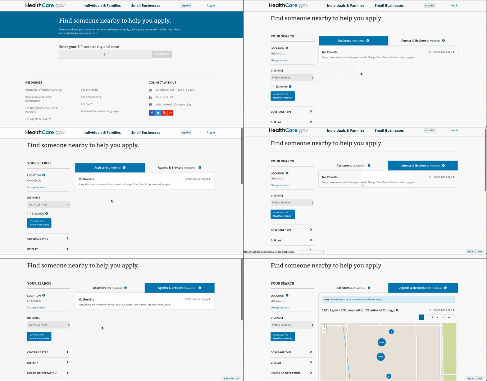
As we began our redesign, we focused on two major issues standing between users and the help they needed. First, users were asked clarifying questions between when they entered their location and when they were shown their search results. Then, when they got to the search results page, they were faced with a “No Results” notification while the system worked to find people near them to help.

In a worse case scenario, users could interpret these long response times as meaning there was no help available in their area, which could cause them to abandon the health insurance sign up process.
When we talked with our CMS stakeholders, we discovered that part of the reason for the additional questions was to give the tool’s backend system time to complete and prepare the search results. But even with this added time, users could still have to wait for results on the final screen. We knew it was important to shorten the distance between asking for help and receiving it, but before we started making changes in the user flow, we needed a backend that was fast enough to make it possible.
We turned to Brian Bonenberger and Brian King on our team to take a look at the backend and see if they could speed up the search results. After some investigation, they found that responses were taking anywhere between 2 and 6 seconds. The problem? The location search didn’t use an index when returning results for users. You can read a deep technical dive into how they used query plans and R-Tree spatial indexes to get the average response time down to 150 milliseconds.
Drastically shortening the search response time expanded the possibilities for how we could redesign the search flow to center the needs of users and match the experience of consumer tools.
Creating an experience on par with consumer internet services
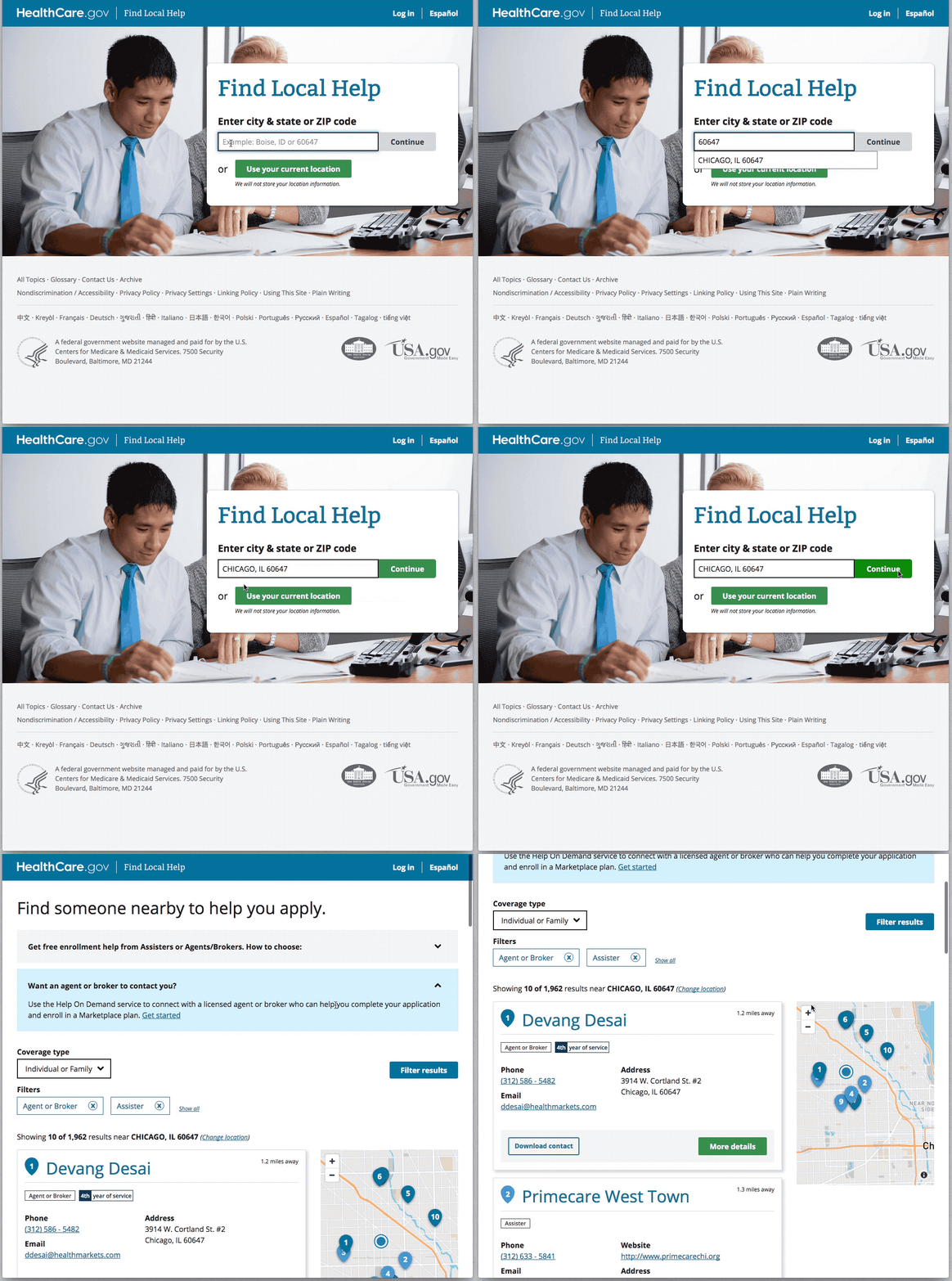
Our first step was to remove the extra questions between entering your location and seeing the local help results. We knew users came to the site to find local help, and it was our duty to get it to them quickly. To bring our CMS partners along with this significant change to the user flow, our product manager Alexis James gathered examples from across prominent search tools like Yelp and Google to show our stakeholders industry standards. She also brought along our engineering colleagues to stakeholder meetings so when people asked whether these changes would be technically possible, our engineers could confidently explain the backend improvements they’d made. After our cross-functional team cleared the path, we turned to improving the search results page.
In the original design of the tool, users were given two separate lists of people who could help them: one for Assisters and one for Agents and Brokers. For subject matter experts, this is an important distinction. Assisters are certified people required to provide impartial information while Agents and Brokers are generally paid by insurance companies and required in many states to act in a consumer’s best interest. Separating the search results into two separate lists makes sense for stakeholders, but for people who need one-on-one help, the priority is to get them a list of everyone who can help.
After working with our CMS stakeholders, we redesigned the search results into a single page with plain language explanations of the difference between Assisters and Agents and Brokers, clear labels, and simple filters to let users see the list that’s right for them. This brings the Find Local Help Tool in line with consumer search tools and ensures the design respects the circumstances users are in when they visit the site.

While these changes weren’t especially complex, they made a real difference in the experience for Find Local Help users. By prioritizing users and bringing a broad set of skills to the table, Ad Hoc was able to help CMS better serve their users and strengthen this critical step in the process to get health insurance.

