Creating a human centered information architecture on VA's developer portal
As announced recently by Department of Veterans Affairs Office of Information and Technology, Lighthouse is the front door access to VA’s high-quality APIs (Application Programming Interfaces) which developers can use to learn about and access services using VA data. The portal launched in August of 2018 as a proof of concept and is a work in progress with development teams constantly improving its offerings.
One of the portal’s most important features is the ability for developers to obtain credentials to begin developing using our API. Today, we automatically serve those credentials to developers when they submit an application to developer.va.gov. Developers can use those credentials, paired with robust documentation, to start developing Veteran-centered applications powered by the same APIs that power multiple VA systems.
It was important for the team to create API documentation in a way that made it easy for developers to find information so that they could start building. As we added additional capabilities to the portal, the design of the portal itself became more crucial to the success of developers finding and accessing that information. We evaluated the current information architecture (IA) of the portal to determine whether or not developers were able to find the information they were looking for.
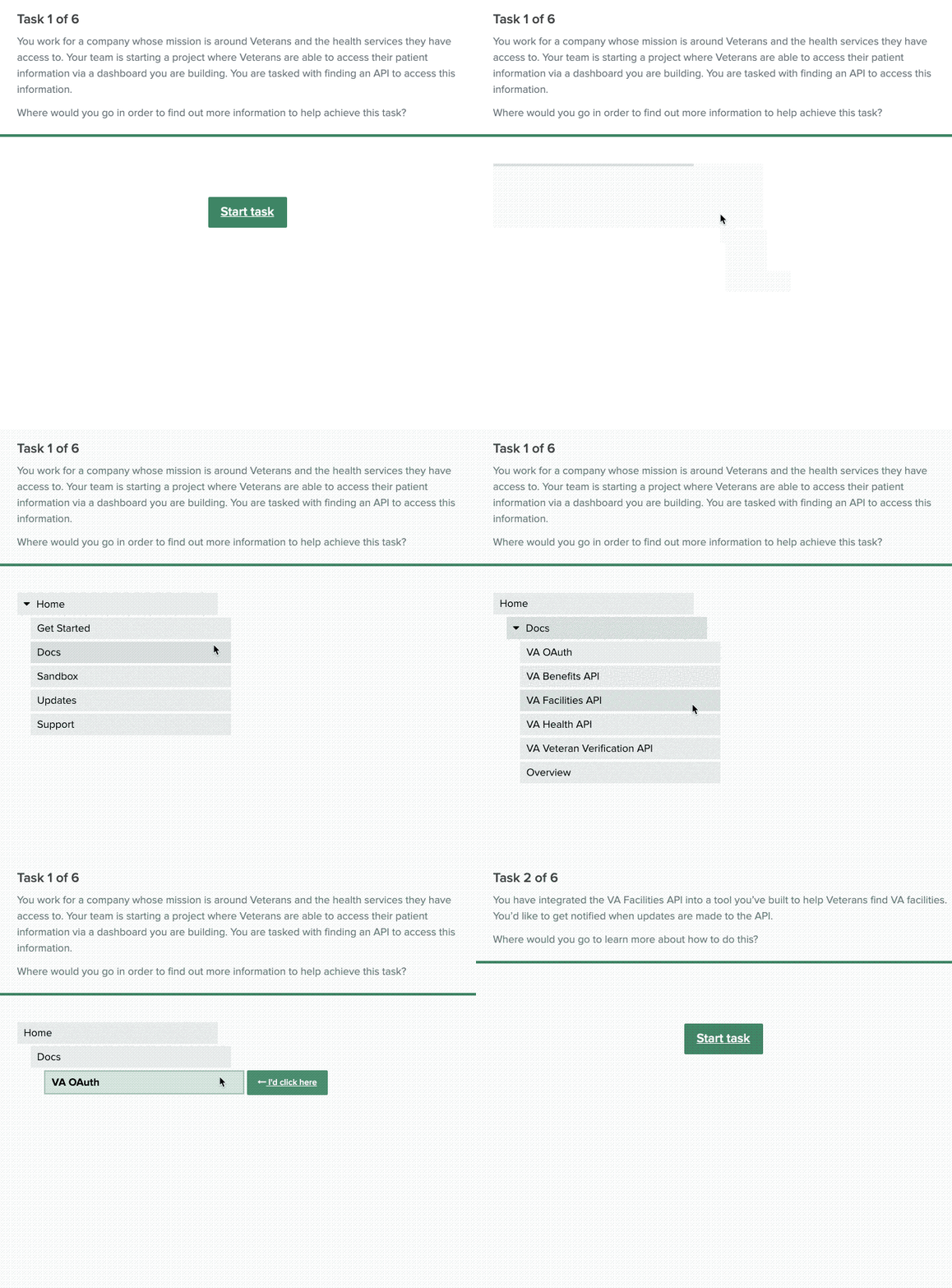
To help evaluate the success of our proposed IA changes, we published a remote, self-paced activity for developers to test the paths that we thought they’d use to find information on the portal. Participants followed the path of a “tree” structure and clicked through to select their answers to the task. We performed this test over the course of a few days in a remote, asynchronous setting.

Each participant went through six tasks which we tracked, accumulated and analyzed. The results from this study showed us that some of our assumptions on the proposed IA were inaccurate. It also helped to set a clear path on how we could change those to better serve developers.
One of the most striking findings from this research was that our assumption about where developers would expect to find information about API authorization was inaccurate. In our original design, information about this was included in the “VA OAuth” section. In our test, none of the developers selected this section first when told to look for information about “Health OAuth.”
Here are the results from that task:
0% Success Rate
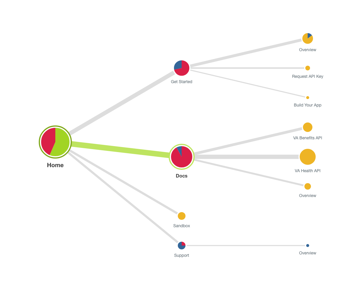
- 62% first clicked on /Docs/
- 34% first clicked on /Get Started/
- 8% first clicked on /Sandbox/
- 3% first clicked on /Support/
As seen in the pietree below, most developers expected to find this information in the VA Health API or VA Benefits API section.

This insight helped us change the IA for the portal so that the authorization documentation now can be found within the API section it is associated with rather than in its own section.
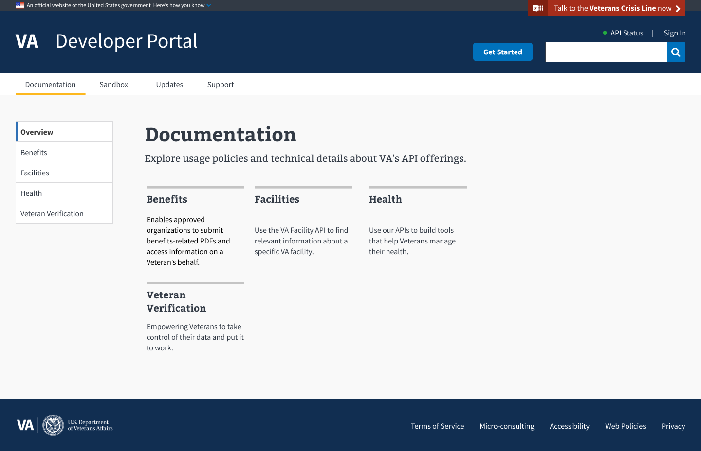
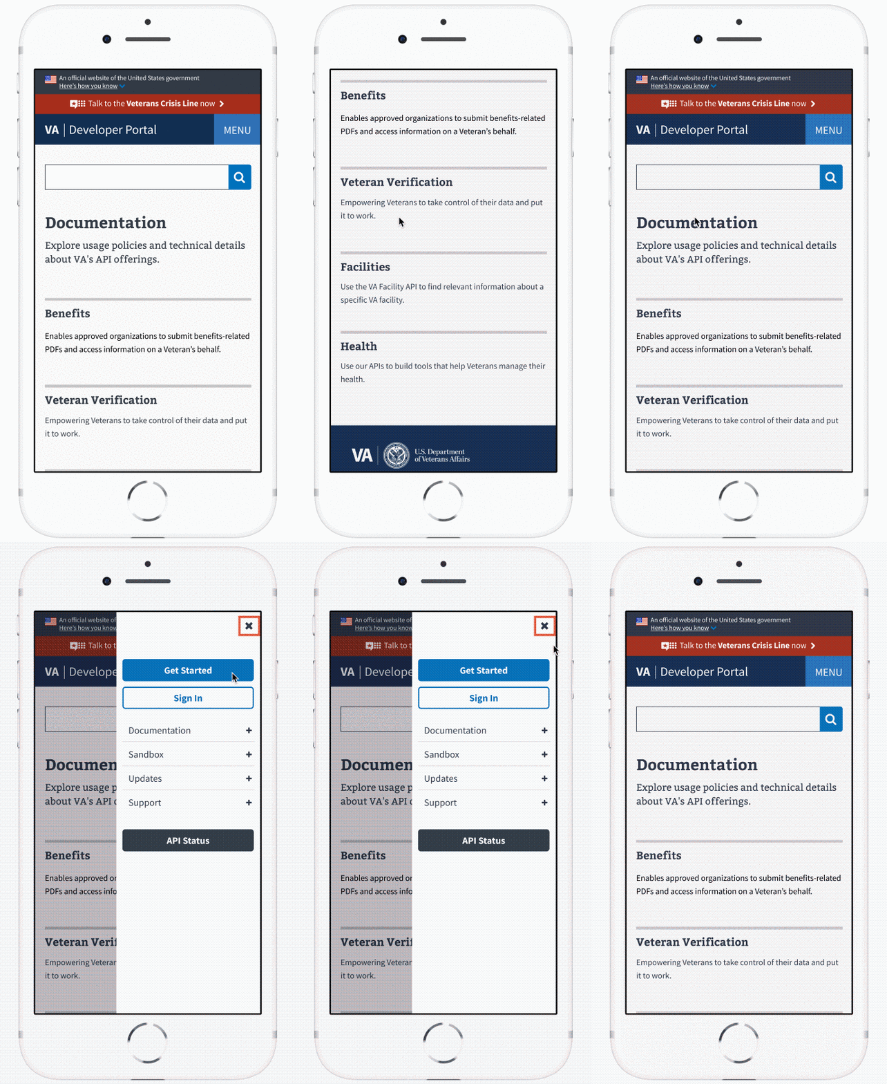
Now that the team had a better idea of the path forward to help meet developer’s needs, we started iterating on high-fidelity wireframes for a new look, feel and IA for the developer portal. We started by completely revamping the main navigation by moving all API information under a main level Documentation category. This not only made sense to do in terms of better IA, but also to help support growth of the program and onboarding more APIs.

We also added a secondary navigation across all of our pages. This helps to support clusters of information that belong under a certain category, such as Support or Updates. This navigation structure is also updated on smaller screens to make it more accessible on various devices.

We’re excited to continue to build out VA’s Developer Portal and to enhance this Veteran-centered API program. We will be posting in the future about creating a developer journey and sharing where we are headed with the program.
Interested in learning more about our program? Feel free to email the team at api@va.gov or open a GitHub issue with feedback or questions.
Illustration by Savannah Million
Related posts
- Bringing service design to the VA digital services platform
- Why design skills are a power-up for researchers
- Our four day discovery sprint with San Jose
- What Jurassic Park can tell us about human resilience and human-centered design
- UX Offsite 2017 in Portland, Oregon
- Launch: VA appeals transparency tool
